Transforming Challenges into Solutions, One Feature at a Time.
As a former instructor at Iran Language Institute, I experienced firsthand the frustrations of the online teaching platform—tedious workflows, inefficient tools, and a lack of user-centric design. My colleagues often shared their struggles, especially with the assignment feedback system, and I realized how these pain points drove users away from the platform to alternatives like WhatsApp.
Armed with this knowledge and a passion for design, I embarked on a mission to improve the user experience (UX) and user retention of the assignment section. This case study details my journey, using design thinking, to identify issues, ideate solutions, and create a more efficient feedback process.
Given that the platform is developed by a government organization with a focus on local systems, the primary goals were:
The first step was to understand the users: instructors and students. Discussions in teacher forums revealed key challenges:
To dig deeper, I conducted interviews with three instructors and developed a 24-question survey to quantify dissatisfaction levels and pinpoint specific issues.
![[Empathy Map & User Persona]](/images/project_02/empathy_map_persona_project_02.png)
The assignment section of the platform is seen as burdensome and outdated, causing a drop in user retention and forcing users to adopt external tools. This impacts the platform's usability and effectiveness.
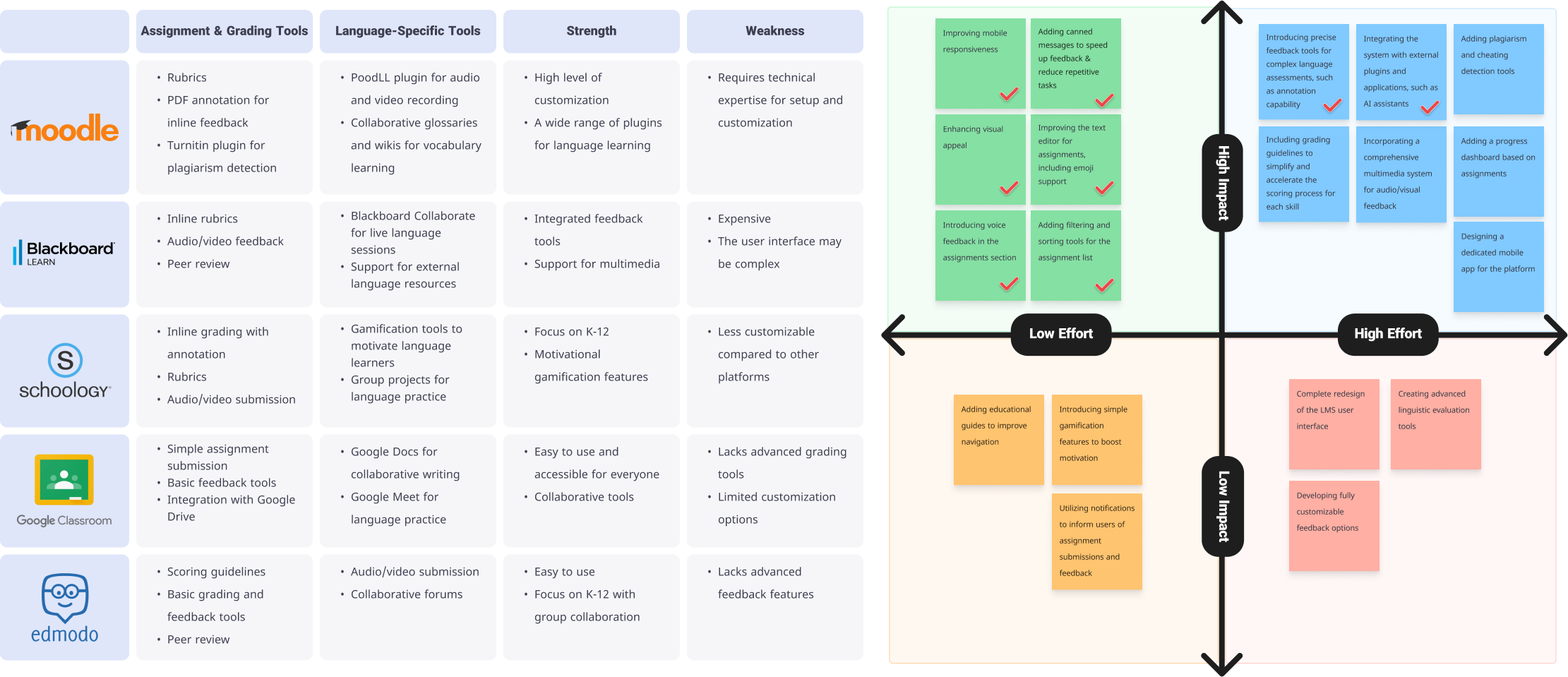
Before ideating solutions, I conducted a competitive analysis, exploring similar platforms to identify innovative features. Inspired by best practices in EdTech, I created an effort-impact matrix to prioritize ideas.
To enhance accessibility and create a cohesive, inviting experience, I introduced a refined color palette adhering to WCAG standards. The colors were chosen to balance readability and aesthetics, improving the overall user experience:
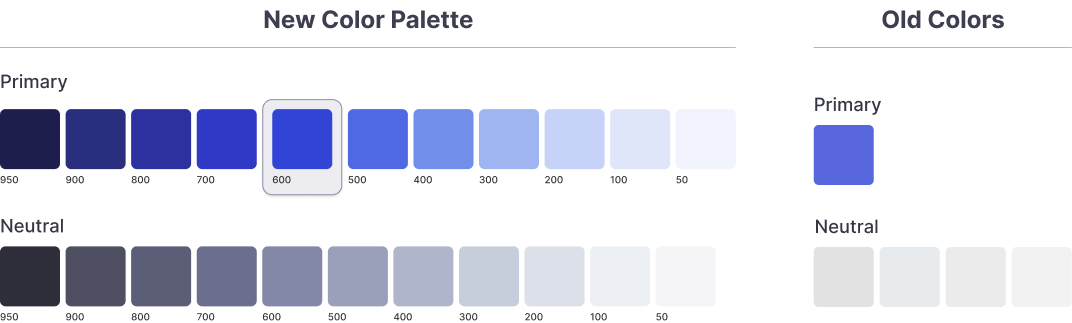
This palette was designed to ensure a professional and user-friendly interface while improving usability for individuals with visual impairments.
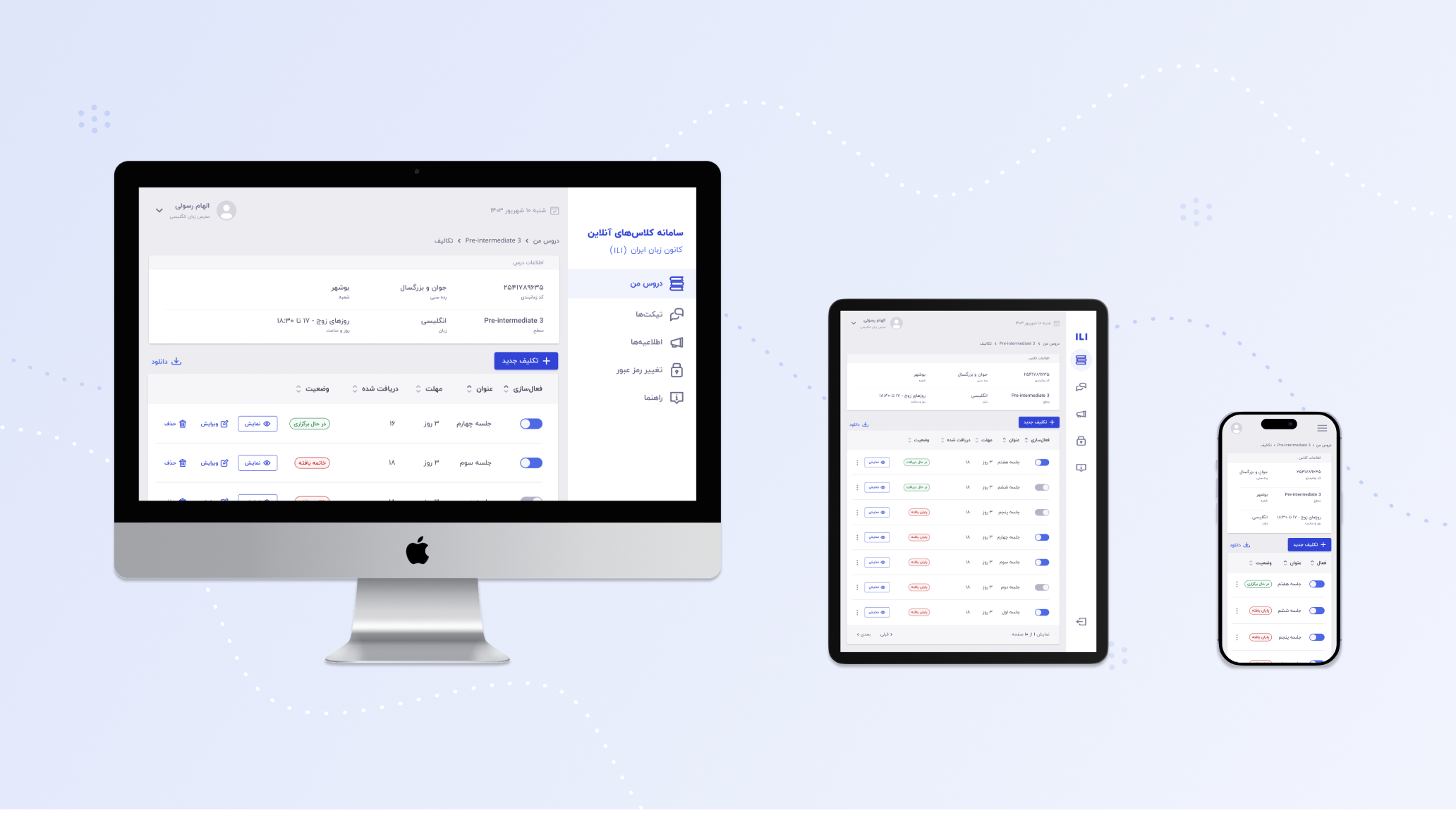
I began by designing low-fidelity wireframes to explore different layouts and interactions for the new features. These wireframes helped visualize workflows and identify potential usability issues early on. The focus was on ensuring the platform catered to various screen sizes for maximum flexibility.


Using Figma, I converted the wireframes into high-fidelity, interactive prototypes. This allowed for a realistic simulation of the user experience, enabling users to test and provide actionable feedback.

Testing was conducted with five language instructors, aligning with best practices to uncover approximately 80% of usability issues.
Instructors across different technical skill levels found the updates intuitive and time-saving. Feedback tools like voice feedback and emoji responses significantly reduced task completion times and added a layer of personalization.
During testing, participants noted the absence of annotation tools for assignments. This feature has been added to the roadmap for future updates.
The redesign resulted in a seamless and efficient feedback process, improved user satisfaction, and helped increase user retention. Instructors now feel empowered, not burdened, by the platform.


By deeply empathizing with instructors' needs, this redesign transformed the assignment section into a space that saves time, reduces frustration, and supports teaching workflows. This project reinforced my belief in the power of design thinking to create meaningful solutions tailored to real-world problems.
Adding annotation tools and conducting further tests to ensure continuous improvement.
Great design starts with listening. This project was about more than just tools—it was about giving instructors the time and space to focus on what matters most: teaching.